The Reserve Bank of India on Sunday announced a new series of Rs 500 and Rs 1000 bank notes that would make it easier for the visually impaired to differentiate between various denominations.
Very noble, but in a country that has more Internet users than the US population and the second fastest-growing Internet growth base--most by access to cellphones--it's high time that the RBI thought up apps such as LookTel (for the Iphone) and IDEAL currency-identifier for Android, that identifies notes with a quick camera scan.
The RBI says that existing notes have over the years evolved to be easier to the touch. So other than the distinct colours and the general rule of larger the denomination, the larger the size of the bank-note, other features include:
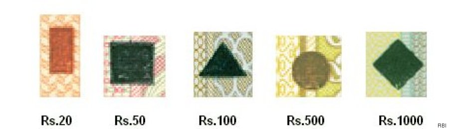
An identification mark on the left hand side of each note which is in raised print (intaglio) and has different shapes for different denominations. There is thus a diamond for ₹ 1000, circle for ₹ 500, triangle for ₹ 100, square for ₹ 50, rectangle for ₹ 20 and none for ₹ 10.
![banknoteid]()
The denomination numerals are prominently displayed in the central area of the notes in raised print.
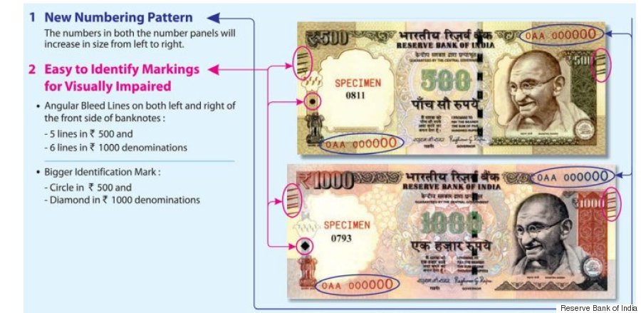
The latest modifications, the Reserve Bank of India says, are a 50% increase in the size of identification marks along with:
![banknotes]()
These new notes are yet to be released, so we don't know the extent to which these modifications will impress end-users. One early test doesn't seem encouraging. It is still however a mystery, why India's notes don't incorporate a Braille-system of raised dots on the notes, akin to the simple and elegant Canadian, tactile currency.
Some of the countries whose bank notes for the blind lead the way in terms of innovation and who've certainly inspired the features that RBI now incorporates in the rupee for the ease of the blind include:
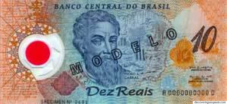
The Brazilian real, uses embossing that's helpful for security as well as easy sieving with your fingers:
![brazil]()
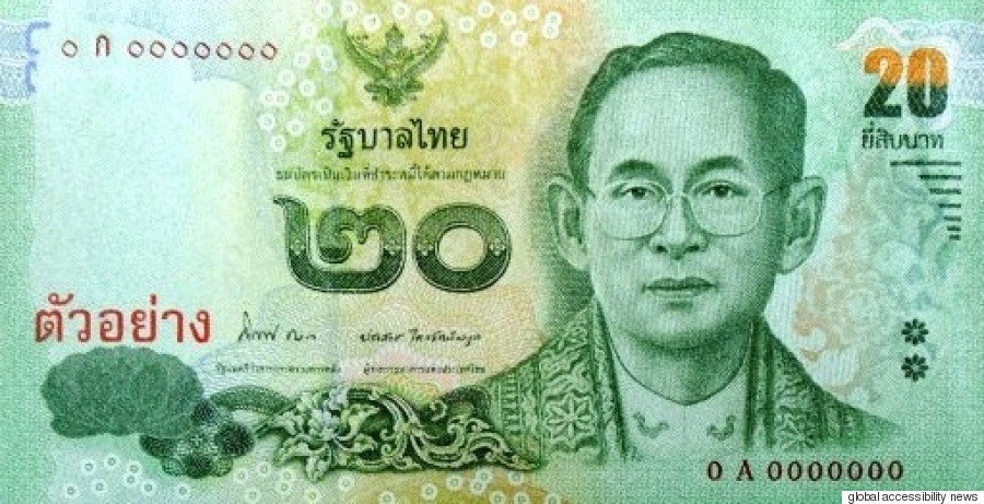
The Thai Baht was among the first to use raised numerals:
![thai baht]()
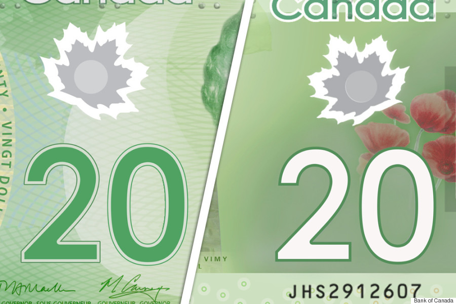
And of course, the pioneering Canadian Dollar that introduced Braille in its notes:
![canada note]()
Strangely, the United States with its thrust on design-thinking and consumer-friendly products still thinks it fit to have every dollar note look exactly the same and with no quarter to the blind. It joins Zambia, North Korea, Liberia and Turkmenistan in being the least blind friendly.
![]() Like Us On Facebook |
Like Us On Facebook |
![]() Follow Us On Twitter |
Follow Us On Twitter |
![]() Contact HuffPost India
Contact HuffPost India
Very noble, but in a country that has more Internet users than the US population and the second fastest-growing Internet growth base--most by access to cellphones--it's high time that the RBI thought up apps such as LookTel (for the Iphone) and IDEAL currency-identifier for Android, that identifies notes with a quick camera scan.
The RBI says that existing notes have over the years evolved to be easier to the touch. So other than the distinct colours and the general rule of larger the denomination, the larger the size of the bank-note, other features include:
An identification mark on the left hand side of each note which is in raised print (intaglio) and has different shapes for different denominations. There is thus a diamond for ₹ 1000, circle for ₹ 500, triangle for ₹ 100, square for ₹ 50, rectangle for ₹ 20 and none for ₹ 10.
The denomination numerals are prominently displayed in the central area of the notes in raised print.
The latest modifications, the Reserve Bank of India says, are a 50% increase in the size of identification marks along with:
- Angular Bleed Lines in the notes with a different number of line corresponding to the denomination. So that's 4 lines in 2 blocks in ₹ 100,
- 5 lines in 3 blocks in ₹ 500 and
- 6 lines in 4 blocks in ₹ 1000 denominations. Here's a sample image from the bank for the 500 and 1000 Gandhis:
These new notes are yet to be released, so we don't know the extent to which these modifications will impress end-users. One early test doesn't seem encouraging. It is still however a mystery, why India's notes don't incorporate a Braille-system of raised dots on the notes, akin to the simple and elegant Canadian, tactile currency.
Some of the countries whose bank notes for the blind lead the way in terms of innovation and who've certainly inspired the features that RBI now incorporates in the rupee for the ease of the blind include:
The Brazilian real, uses embossing that's helpful for security as well as easy sieving with your fingers:
The Thai Baht was among the first to use raised numerals:
And of course, the pioneering Canadian Dollar that introduced Braille in its notes:
Strangely, the United States with its thrust on design-thinking and consumer-friendly products still thinks it fit to have every dollar note look exactly the same and with no quarter to the blind. It joins Zambia, North Korea, Liberia and Turkmenistan in being the least blind friendly.
 Like Us On Facebook |
  Follow Us On Twitter |