Remember the picture of India lit up during Diwali shared by 'UNSECO'? That picture has turned out to be fake. But the Diwali space map is now a reality due to a web project by World Bank called "Twenty years of India light".
This GitHub-hosted project shows us light throughout India in selected 600,000 villages. The World Bank, a software development firm Development Seed, and Michigan University's assistant professor Dr.Brain Min has developed a project using open lights API to display the lights through 20 years.
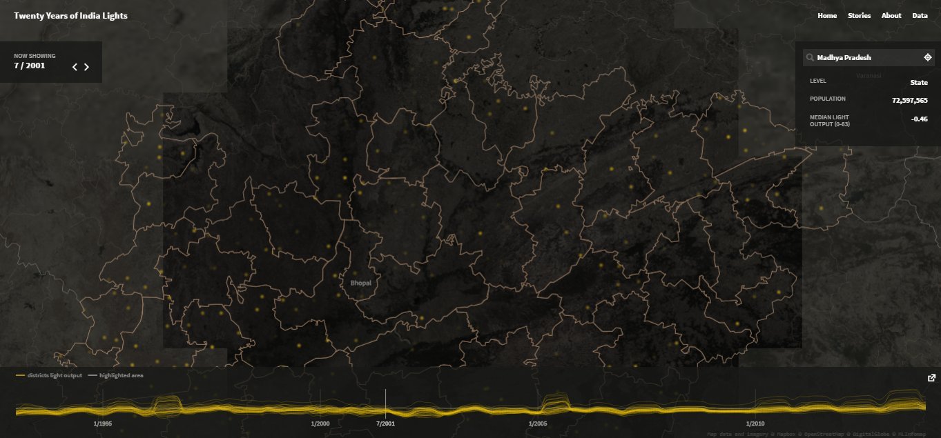
Each point on the map represents a specific village. And the map data is the result of 20 years of satellite images collected by Defense Meteorological Satellite Program (DMSP). You can scroll through the timeline and see the effects of light across the years.
You can also zoom in to see the state level light curves. The maximum zoom level you can attain is to the district level. At the sidebar, you can see the level you have zoomed in till, population, the number of villages, median light output (from level 0 to 63) and villages in national electrification program.
![state level lighting]()
The methodology used behind this is that the developers rated each pixel from 0 to 63 with 0 being no light. Then they filtered out the cloud cover and smoke according to recommendations from the National Oceanic and Atmospheric Administration (NOAA). Then they aggregated each month's data by running multiple algorithms to reach the final conclusion.
They have also posted an analytical story covering how the India has lit up across the years on the occasion of Diwali. Here is a slide show showing the median lighting from the year 2005 to 2013.
![]() Like Us On Facebook |
Like Us On Facebook |
![]() Follow Us On Twitter |
Follow Us On Twitter |
![]() Contact HuffPost India
Contact HuffPost India
Also on HuffPost:
This GitHub-hosted project shows us light throughout India in selected 600,000 villages. The World Bank, a software development firm Development Seed, and Michigan University's assistant professor Dr.Brain Min has developed a project using open lights API to display the lights through 20 years.
Each point on the map represents a specific village. And the map data is the result of 20 years of satellite images collected by Defense Meteorological Satellite Program (DMSP). You can scroll through the timeline and see the effects of light across the years.
You can also zoom in to see the state level light curves. The maximum zoom level you can attain is to the district level. At the sidebar, you can see the level you have zoomed in till, population, the number of villages, median light output (from level 0 to 63) and villages in national electrification program.

The methodology used behind this is that the developers rated each pixel from 0 to 63 with 0 being no light. Then they filtered out the cloud cover and smoke according to recommendations from the National Oceanic and Atmospheric Administration (NOAA). Then they aggregated each month's data by running multiple algorithms to reach the final conclusion.
They have also posted an analytical story covering how the India has lit up across the years on the occasion of Diwali. Here is a slide show showing the median lighting from the year 2005 to 2013.
 Like Us On Facebook |
  Follow Us On Twitter |
 Also on HuffPost: